Week 8
Introduction to ggplot2
Soci—269
Visualizing Data in —
October 20th
Reminders
Coding Assignment in
Coding Assignment Deadline
Your first coding assignment is due by 8:00 PM on Tuesday, November 4th.
Reminders
Coding Assignment in
Using ggplot2
Getting Started
Launch RStudio and run the following code:
Give me a when all the packages have been installed.
Getting Started
You can access data for today’s session by
executing the following code:
Getting Started
A Quick Example
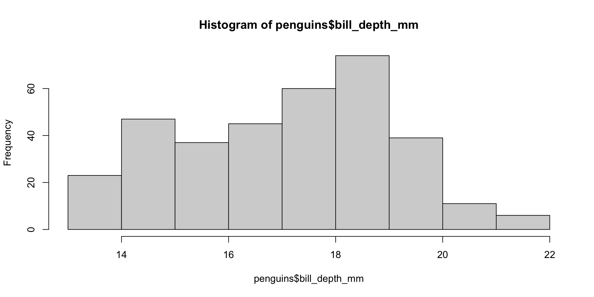
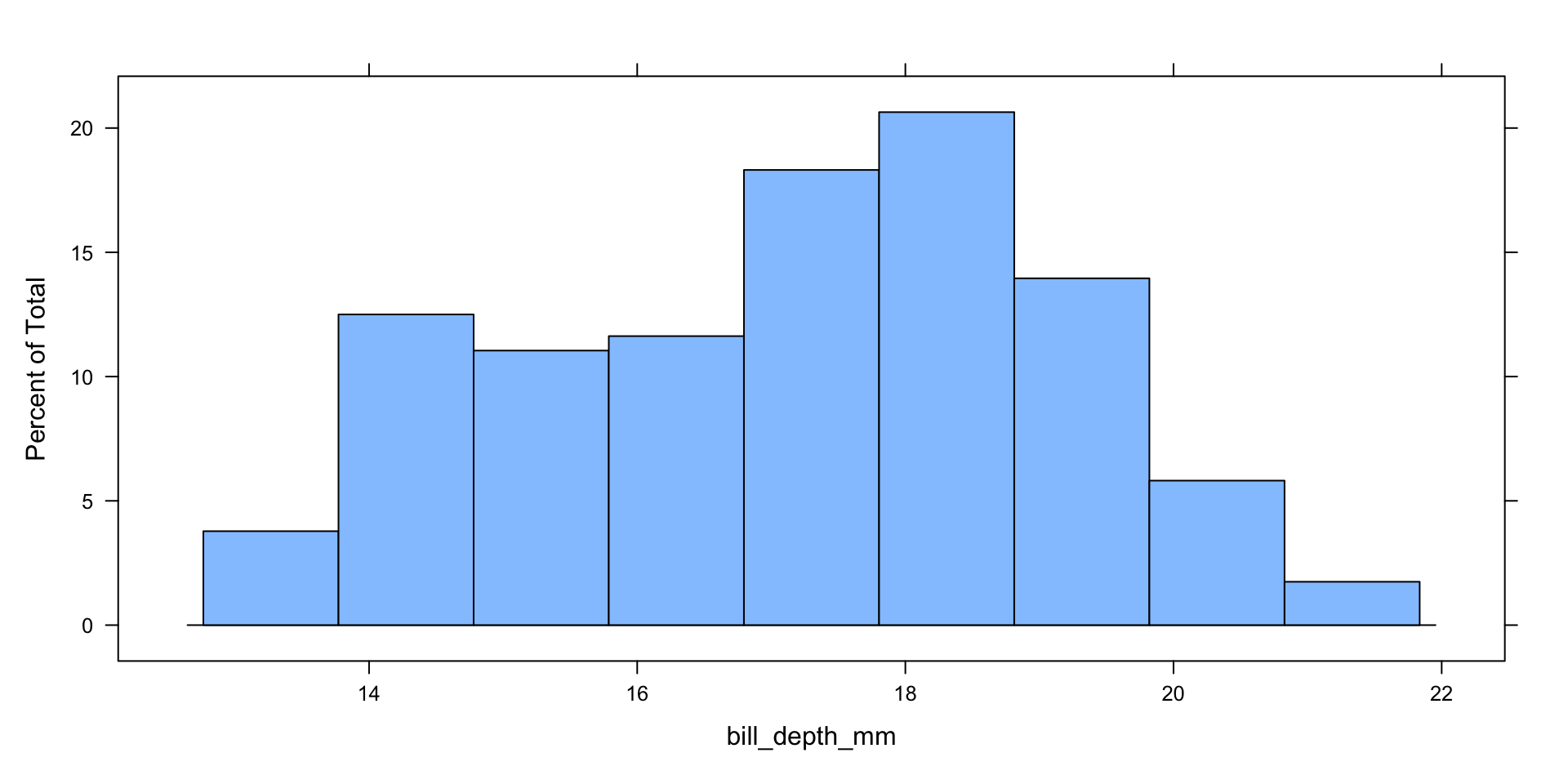
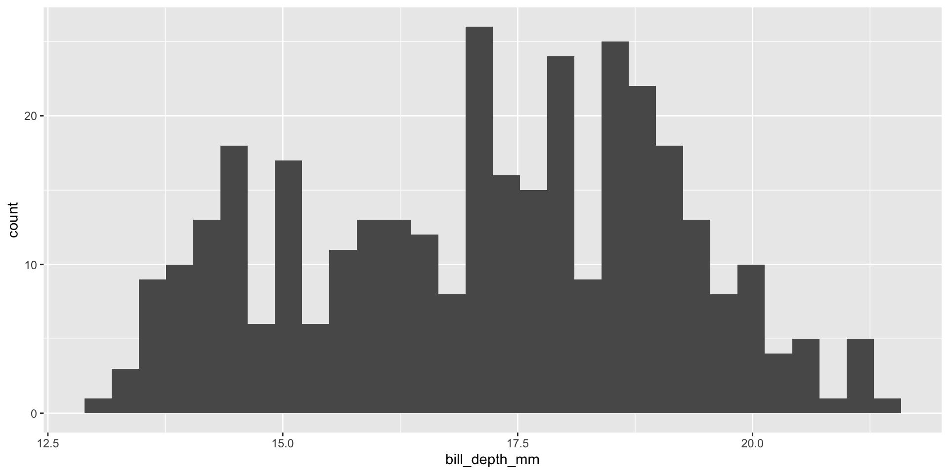
Comparing Histograms
The Grammar of Graphics
What Is a Graphic?
Wilkinson (2005) created the grammar of graphics to describe the fundamental features that underlie all statistical graphics. The grammar of graphics is an answer to the question of what is a statistical graphic? ggplot2 (Wickham 2009) builds on Wilkinson’s grammar by focusing on the primacy of layers and adapting it for use in . In brief, the grammar tells us that a graphic maps the data to the aesthetic attributes (colour, shape, size) of geometric objects (points, lines, bars). The plot may also include statistical transformations of the data and information about the plot’s coordinate system. Facetting can be used to plot for different subsets of the data. The combination of these independent components are what make up a graphic.
(Wickham, Navarro, and Pedersen 2025, EMPHASIS ADDED)
Building Blocks
Step 1:
Data, Aesthetics, Layers
Our Data
Let’s Move to RStudio
Note
The rest of today’s session will take place in RStudio!
Visualizing Data in II—
October 22nd
An Invitation
The Cummings Lecture
Title
Something Between Us
The Everyday Walls of American Life, and How to Take Them Down
Description
Click to Expand or Close
Scroll to access the entire description.
In 2016, Anand Pandian was alarmed by Donald Trump’s harsh attacks on immigrants to the United States, the appeal of that politics of anger and fear. In the years that followed, he crisscrossed the country seeking out fellow Americans with markedly different social and political commitments, trying to understand the forces that have hardened our suspicions of others. The result is Something Between Us, a groundbreaking and ultimately hopeful exploration of the ruptures in our social fabric, and courageous efforts to rebuild a collective life beyond them. Through vivid encounters with Americans of many kinds, Pandian shares tools to think beyond the twists and turns of our bracing present.
Date and Time
Location
Yet Another Reminder
Coding Assignment in
Coding Assignment Deadline
Your first coding assignment is due by 8:00 PM on Tuesday, November 4th.
Yet Another Reminder
Coding Assignment in
Today’s Preliminaries
The Data
Today’s Script File
Download Some Fonts
Steps 2 & 3:
Scales, Coordinates, Facets; Themes, Labels and Guides
A Quick Refresher
Let’s Launch RStudio
Note
The rest of today’s session will take place in RStudio!
Some “Homework”
Access Census APIs
You’ll need to obtain valid API keys to use the
tidycensus and cancensus libraries next week.
Enjoy the Weekend
References